ABOUT US
The development of Ed. Rod was not simply a design exercise, but a process of strategic construction. We started with a briefing that had a clear intention, but no defined direction. Through market analysis and the identification of real opportunities for differentiation, we transformed a general idea of “varied American clothing” into a brand with its own concept, stance, and structure.
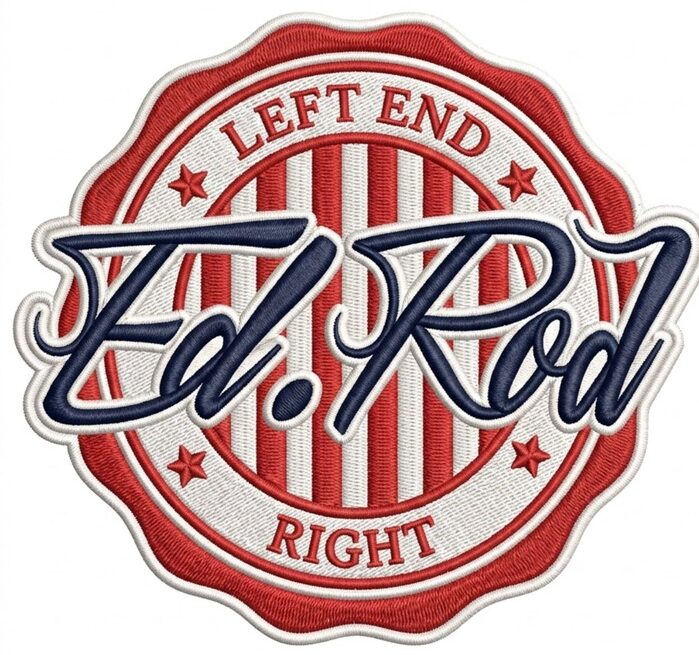
The decision to adopt American Curation as the central axis allowed us to bring coherence to the entire system: positioning, values, verbal identity, and visual construction. The brand no longer competes through volume; it begins to compete through distinction. The logo stops being a graphic resource and becomes a symbol of certification and guarantee.
Every element — from the circular emblem to the typography, the muted color palette, and the classic American aesthetic — responds to a clear intention: to communicate authenticity, trust, and character. There are no arbitrary decisions; every visual and conceptual component reinforces the Ed. Rod standard.
The result is a brand with a solid identity, real differentiation from the competition, and a concrete promise: not to import just anything, but to select the best.
Ed. Rod does not sell American clothing.
“It goes beyond trends.”